user experience and information design
 The start point of a session. The user may discover key areas in need of immediate attention prior to drilling down to more their own fund analysis 'territories' |  Funds are seen based on dealer activity: buys, sells use of margin, haircut thresholds etc. |
|---|---|
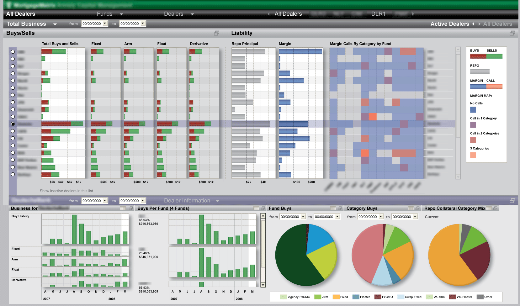 User has selected a dealer from the table above to show their specific metrics in the area below. |  Evaluation of fund allocations, comparison with targets, and modeling adjustments through hypothetical trades |
 Activity metrics, buy details, collateral structures and credit details for a specific dealer | 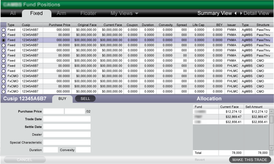 A specific fund's holdings, with a means to trade and manage allocation of said holdings |
A HEDGE FUND DASHBOARD
This hedge fund's analysis and management dashboard needed better organization and workflow navigation, more consumable charting, ad-hoc scenario modeling and the ability to share and publish metrics.
This redesign establishes a more 'lush' and branded presence, featuring tear-away modules that could be isolated, shared and published with analysts and shareholders as needed.
Headers provide both fixed and 'learned' navigation based upon the user's pathways that can be fine tuned and captured for later use. This made working through daily, monthly and quarterly analysis routines a much more fluid experience.
Grid cells are overlayed with bar charts, sparklines and heat map features. Interactive allocation-over-time charts were introduced, and dashboards include contextual modeling and execution tools for taking action based on the analysis performed.